It was a car free day at Centennial and given my car was full of kids and stale bread we were headed over to Victoria Park near Sydney uni to feed some ducks. But not before a little pit stop at MOP projects to check out their current show ...
'When good curators go bad' starts with the premise that they would get some art world administrators who had fine art backgrounds but who hadn't worked as an artist for 5 years to make some stuff for a group show. I was actually pretty intrigued by the concept. This was supposed to 'open up a dialogue with the past to question what is an artist and how it is defined in today's society'. Which I'm not really buying. If you didn't know who these people are (and I must confess I don't know who most of these jokers are) you would just think you have walked into a really ordinary group show. Lisa Havilah had a funny piece I liked, 'I'm with stupid', but then again I go for text works. My kids liked Bec Dean's karaoke video, especially as their were two headphones to hear the track. Adam Hollingworth and Sophie Kouyoumdjian's photos with neon over stovetops wasn't too bad but the rest was pretty random - I think I could've slipped something in here without anyone noticing. But then again my work always questions what it is not to be an artist. In the next room was another video installation - Jodie Whalan's 60 kilograms. In the bit I saw she was getting a tough sticker (aka a tattoo) on the back of her neck with her target weight - 60 kgs ... okay then, whats on deck for the next trick? No images as MOP don't want to scare you away and the gallery assistant was watching my troop like a hawk as there were a couple of installations that looked at risk to a couple of toddlers racing around the space.
Points - 3 to Lisa, 2 to Bec and 1 to Adam and Sophia. The ducks were much better.
Sunday, May 29, 2011
Saturday, May 28, 2011
Marrickville tour - 28 May
 Inspired by the recent State of Origin I had arranged to meet a few mates over at heavenly Henson Park to take in some league action as the Newtown Jets were hosting my very own Bears for some NSW Cup action. Given this was my first trip out to Marrickville I decided to squeeze in a couple of galleries before kick-off.
Courtesy of one of the maps from the art month sydney website (which was in March but the website still works, gots to love the intrawebs!) I was able to plan a walking tour between ESP gallery, Factory 49 and the Henson Park Hotel. These galleries are both not for profit artist run initiatives. ESP had a group show starting - opening was Saturday at 4pm. Umm, what about the clash with the Jets home game? And they say the arts isn't trying to be elitist! The ESP show was a real mixed bag, everything under $1,000 and it would've wanted to be. I didn't mind Will Coles' cement casts of skulls but that was about it. Factory 49 was a bit more interesting. A partially converted warehouse (I don't know if it ever was a real factory but it probably sounds cooler), they had an interesting installation by Amarie Bergman in the main room. This was a big letter H made in softwall (like a big room divider made from that really tough tyvek paper). Unintentionally funny was that I kept setting off the beeper that let the office know someone was in there as I walked around it, perhaps that was part of the piece. In the office they had some works of Kate Mackay which didn't do all that much for me, although researching her online I would have liked to see her Room Cubed installation from last October.
 Points - 3 to the Jets (pictured above with the Frank Hyde shield), a great day had out there. They really turn the clock back with an excellent atmosphere and I managed to pick up a limited edition stubby holder to add to the big lamington collection! 2 to Factory 49, a promising space just around the corner from the pub and the back gate to Henson Park, they should come up with a game day promo to get some more punters through the gallery before kick-off. 1 to ESP.
 Sunday, May 22, 2011
New contemporary galleries at the AGNSW - 22 May
 Opening weekend and I thought I'd brave the crowd with one of my junior art critics in tow for a late Sunday morning stroll. The new galleries are apparently the old storage rooms and occupy the 2nd basement level. You can get there by the stairs, the escalators or even the elevator and by the time we left we had used all three. What were the initial impressions?
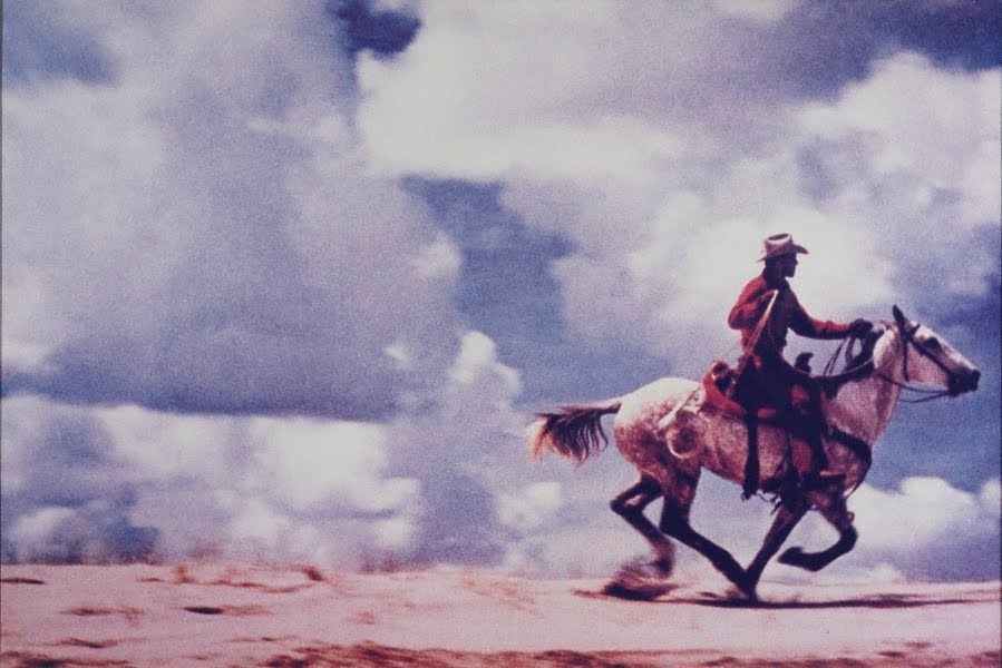
Well we arrived via elevator which is not the grandest entrance you can make. I think grand is what they were trying to design for the escalator arrival but I think the art at the staircase is much better. Here you are greeted by Ugo Rondinone's 'clockwork for oracles' which is a collection of framed coloured mirrors and a large Richard Prince cowboy (just so happens this is my favourite Richard Prince and I have it as my computer background, I saw this image auctioned at Phillips in NY back in 2005 when it set the record for most expensive contemporary photography; for a little bit of banking trivia the mirror image of this photo is in Patrick Bateman's apartment in American Pyscho!). I didn't think much of the Christo works. I know he wrapped Little Bay back in the day (before I was even born) but I probably got my fill from him when he did the Gates in Central Park (which I did like). Likewise I was really disappointed with the Jeff Koons stuff on show. I know he does banality but most of his work here (small puppy, mixed rocker, bronze basketball) actually deserved to be in the gift shop rather than the gallery. I have seen much, much better Koons than this. Probably a similar sentiment to the large Thomas Struth photos. The Sol LeWitt works, by contrast, were genuine drawcards. The big room dedicated to his Wall Drawings was very memorable. We were drawn towards the Tony Cragg sculpture which kind of reminded my daughter of a Christmas tree and really liked the Shaun Gladwell video work - approach to mundi mundi, is this on youtube yet? Other works that caught the eye were the Donald Judd sculpture (maybe I liked this as I do need a new set of shelves) and some of the photos of Rosemary Laing (who I recognised from somebody else's collection).
All in all a promising space although the collection, mostly the collection of a single benefactor, is a little mixed - some strong pieces and some ordinary pieces by a mix of household names and others not so well known. I am sure we will be back to check this out again. One other funny thing is that the AGNSW has developed their own character, Pertinos, to lead the kids tours. Mine was absolutely terrified of this crazy green lady and our own tour was designed to avoid any room with them. Maybe next time.
The points today are from my daughter, and I am pretty happy with the allocation so won't even edit - 3 for Richard Prince, great to know that Sydney has a really iconic one of his works. 2 to Tony Cragg's Spyrogyro and 1 for Shaun Gladwell's video - gee we hope he doesn't fall off. Also an honorable mention to the AGNSW gift shop which has helpfully done postcards of the nice stuff.
Friday, May 20, 2011
New acquisitions - Ann Carrington
 It is interesting where you learn about new artists: going to galleries and museums, reading magazines, and occasionally reality television. One of our favourite shows of 2010 was this crazy show called Nine by Design which followed two interior decorators who have 7 kids (and here we are complaining 3 is tough!) and build these amazing houses in New York which have really cool interiors. Anyway, one artist that they had a few pieces of was Ann Carrington. My wife adored her 'Pearly Queens' where Ann has appropriated the famous visage of the Queen from the Royal Mail stamps and done them in pearl buttons sewn onto canvas.
After a little bit of sleuthing we found Ann's website and were able to commission our own pearly queen. Unsurprisingly this image has been a hit and echoing David Frazer (who reckons he could make a living of just one of his prints), Ann has quite a few Pearly Queens out there. As a result she gives them all unique locales to reign over, apparently like the actual Pearly Kings and Queens of London fundraising (the image above is the Pearly Queen of Bow from her website). We had given Ann a few suggestions as this was something to remind my wife of her English grandparents and so ours is the Pearly Queen of Basil Street after a favourite haunt of theirs in Knightsbridge.
Points - 3 to Ann for an amazing work. Looks great on the TV and even better in person. 2 to the Mrs for organising it all. I was quite impressed when I arrived home one day to find a huge packing crate waiting near the front door. 1 point for Bob and Cortney for the referral, their book is pretty good too.
Saturday, May 14, 2011
Garth Knight at Iain Dawson - 14 May
 Second stop on Saturday afternoon saw the clan hit Iain's shop for a flying visit, the time constraint arising as my three year old art critic didn't think much of Garth's body of work and demanded we hit the playground instead. This was fine as I had seen some of these works at the Australian Centre of Photography in a group show earlier this year (that January show was much better than ACP's current one which is quite ordinary for my money). I did find a few things that would give the slippery dip a run for its money ...
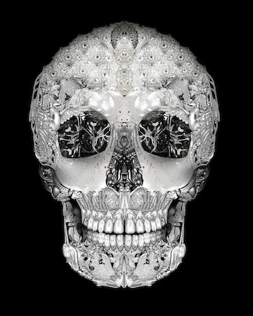
The jewelled skull was probably the pick of the crop back then for me - very Damien Hirst (a very small print of 'for the love of god' graces our stockroom). Looking around his current show I am not sure anything was going to beat that image. Garth looks to be a master of photoshop - manipulating images of jewellery into all these different forms. I was disappointed that these were all so big - of the 16 images only 2 had both dimensions under 100cm and 11 had both dimensions bigger than 100cm, the biggest was 100cm x 225cm. I remember reading a few years ago a NY dealers advice to artists to make photos big because they sell well. From the last few photo shows I've seen it looks like this advice is now universal. The skull looked the most popular with the punters with quite a few red dots on this edition of 10 (125 x 100cm - $3,750). Iain's website says there is a smaller skull on offer, this is still 75 x 60cm, although I wouldn't mind a 30 x 25cm - I think it would still work. The bigger stuff was up to $4,600 which is a lot for a photo but the room sheet says these are all c-prints, and not that I know all that much about photos but a c-print usually means a real old school kodak style chemical print rather than a digital print or giclee which means a big colour printer.
Points - 3 for the jeweled skull, I'd consider playing this off against my Hirst print if they were of similar size; 2 for the beetle, which is the buy of the show at only $1,800; and 1 for the honey bee which was one of the bigger works but did justify its size with the details in it. You can see the whole show here
Samantha Everton at Dickerson Gallery - 14 May
 We had seen Fenella check this show out on Art Nation and given the Dickerson Gallery is only a stroll away decided to swing by on our Saturday afternoon walk. Time flies, I can remember seeing Samantha's last show back in April '09 and being impressed - what about the new stuff?
According to the blurb, marionettes (as the show is called) "accesses realms of the uncanny that that Everton calls 'magic realism' ". Okay then. The colours in this show are pretty similar to her last one, except this time the subjects are women instead of girls. They still have this 50's vibe and the sense that Samantha puts in a fair bit of work in the digital darkroom. This series is meant to deal with grown up issues like losing control - the mother of my three kids really related to the images. All of them were about 90cm x 100cm. I liked the easy to comprehend (if a little toppy) pricing system - all 11 images were $4,000 for an edition of 8 and 1 artist proof (you obvioulsly only need to run the colour printer once to check?). This was the show's last week and most images had one or two red dots but Birthday wish (pictured above) had 6 red dots and 2 half dots (which usually means reserved) so you better get in quick if you want the last one. I think you might be able to ask for discount on the others.
Points: 3 to Birthday wish - as much as I don't necessarily like following the crowd I did agree with 6 punters' hard earned that this was the pick of the prints; 2 to Spring passing and 1 to Chameleon. You can see the whole show here and whilst you miss a bit of sense of scale (and the magic realism of being in a gallery) I reckon Samantha is one artist that they could easily do internet sales for.
Tuesday, May 10, 2011
Salon des refuses at SH Ervin - 10 May
My broker mate (who would like to be known as Pascale!) was keen to go check out the salon des refuses at the SH Ervin. This is marketed as the best of the rejects from the Archibald and Wynne prizes as determined by a couple of art dealers and the SH Ervin gallery director. It is meant to be prestigious in its own right but the crowds (or lack thereof when we visited) put paid to that theory. The two things I enjoyed about the salon were that they give you an actual paper ballot paper to vote for the people's choice (unlike waiting for a computer at the AGNSW) and they put prices in the catalogue. You can walk away with a rejected work if it grabs you! I think the AGNSW should institute this next year. On to the show ....
The gallery mixes the Wynne and Archibald entries (it is pretty easy to guess which is which given the portrait / landscape subject) which is a nice touch. I found it interesting to see how popular some subjects are in Archibald terms. Pat Corrigan had two portraits in the salon. Charles Waterstreet was in the salon and the Archibald. Julian Meagher tried it on with a portrait of an AGNSW curator but that wasn't the secret key to the Archibald and he was here at the Salon instead. All in all a really interesting little show. I am sure more people would go if you could actually get to this gallery (it is a hike) and if they didn't hit you for 7 bones at the door, at least it is a little cheaper than the real thing. Although one big complaint is that there are no images online - probably to make the punters rush through the doors.
Points: 3 to Robert Hannaford for his portrait of Trevor Jamieson. Really nice work but not gracing the walls of Big Lamington HQ with a $30k asking price. 2 to Fiona Lowry for her colourful landscape with a very long title. Given the content of the Wynne this year she was unlucky not to get a guernsey there. 1 point for Guy Maestri's portrait of Pat Corrigan. I thought this was the best of the Corrigans in the exhibition and at $18k compares favourably to what he had on show at Tim Olsen back in March. If I was Pat (or related to him) I would pick it up. For those interested Pascale gave his people's choice vote to Ben Smith for his portrait of Sarah Blasko - he has always been a sucker for a pretty face!
Saturday, May 7, 2011
Jasper Knight at Chalk Horse - 7 May
 The team had seen a Jasper Knight show in February, he has a piece in the Wynne and now he has another solo show at Chalk Horse in May. How do you spell prolific? This was called the Sydney Boat Show and not surprisingly all seven works were boats. This was my first Chalk Horse show and I think their new space is great and very compact - a converted receiving dock with a little wall space on street space and a little bit more up on the dock level.
 Of the 7 works in the show there were 3 pretty big pieces which included the replica Endeavour sailing ship, the Arctic P (the Packer family's converted icebreaker) and a scene from a small Victorian fishing village. These 150 x 200cm works were priced at $20k. There were 4 smaller works which were on cardboard and I think these were $3.5k each. We were there on Saturday (this had opened on Thursday night) and six red dots were already up with only one of the smaller works available. Nice result for Jasper - keep cranking these out. We liked the boats but still think a piece of farm machinery is at the top of our Knight wish list.
Points: I am going to stump for all the big ones as they really make an impact - they were the favourites with the kids as well. 3 points to the Arctic P - really good story behind this boat. 2 to Port Albert - probably the most colourful (pictured) but where is Port Albert again? 1 to the Endeavour replica, maybe whoever bought Ben Quilty's Captain Cook bought this as a companion piece.
Thursday, May 5, 2011
ex de medici at SSFA - 5 May
 Well we were always going to go and see this show at some stage but it was touch and go whether we would make the opening night drinks. Some fortuitous babysitting arrangements and a spur of the minute decision saw the Mrs and I make the trek over to Zetland for a glass of red and a sparking water. We were there just after 7pm so must have missed the talk if there was one. ex is meant to be a bit of a recluse so am not sure if she was even there. Maybe she was letting the work speak for itself ...
ex has been a war artist through the war memorial program. I think she was Afghanistan given the poppies on show here. The highlight of the show is a 4m long watercolour work called 'Cure for Pain'. It was also pretty pricey at $200k - they even put a little masking tape line down on the floor to keep the wine stains away. This had a red dot so am sure there were smiles all around at that vindicated pricing strategy. ex had put little hash marks on the bottom of detailed works describing how many days it took to do. I think cure for pain was 1/3 of a year in all (I took someone's word for it as I was not counting the lines). It was really quite stunning with amazing detail. There is also a fairly decent essay explaining the work on the room sheet which is also online here. I was convinced an institution would've picked this up (i think Mona has a big work of medici's) but apparently not - so get there and see it before it goes behind closed doors. The studies of helmets were very good and were priced pretty competitively at sub $10k but looked pale in comparison to the major work. The triptych was probably the only thing left at $60k. It was an interesting work as apart from size I didn't see much connection between the one of the pieces and the other two. I suspect this will be broken up although I would guess the left hand side piece would get more than its pro rata share as it is the best piece. All in all a great show and really interesting to see this in the flesh after reading the rather breathy review in the art collector magazine (they were VERY big fans).
Points - 3 to Cure for Pain, I would love to see the framing bill for this - I don't even think this would fit in our local framing shop on Paddington st. 2 to Sleepwalking with Bizhad's needle (the poppies from the LHS of the triptych). 1 to the bonus exhibition from the stockroom upstairs. It was nice to see some Lindemans and Laith McGregor works out of cycle.
Moran Prize at the State Library - 5 May
 When I said it was art prize season I really meant it. Based on (a) proximity to my office and (b) it being free, it was only natural that I would venture across the road to check this one out. The Doug Moran prize is a bit of an enigma to me. Sure the Moran's offer $150,000 to the winner, making this the richest art prize in Aus, but do they get the best entries? Let's see ...
The winner this year (as judged by last years winner Michael Zavros and Louise Doyle of the National Portrait Gallery) was Vincent Fantauzzo with a portrait of Baz Luhrman. I agreed with one of the punters who loudly commented that his packers prize winning archibald entry was better. Ditto for Deidre But-Husaim although this was a closer thing - she even had exactly the same person (Roy Ananda on a chin support) as her archibald entry. Adam Cullen also had a recognizable work in each, his Michael Reid portrait gracing the Moran. Robert Hannaford's Gallipoli entry was also better than his Moran. This show really didn't grab me and the fact the Morans can't get this hung at a more salubrious venue (no offence to the State Library but to get to this show you need to walk through a carved tree exhibit and the whole show is hung a little shoddily) asks a lot of questions about the whole endeavour. Even more confusing they have a photo exhibition next door. Is photography art? Why not make it one united competition? If I were Doug Moran I would probably save my shekels on all the comps and just build my own White Rabbit. Or at the very least get Richard Bell to be the judge next year!
Points - 3 to Shane Bowden and Dean Reilly for their portrait of Max Markson, if I had to get a portrait done out of the contestants here they would've got the nod. 2 to Justin Cooper, I'm not sure I loved it but I think I prefer to be challenged rather than bored. 1 point to self taught Canberra artist Ross Townsend for his portrait of Laurie Daley. He has won a couple of ribbons at the Canberra Show and that is good enough for me. Although he could've done a much more interesting portrait of Laurie in the laneway behind the Private Bin - there is a reason it was called Laurie's Lane when I was at uni ...
Tuesday, May 3, 2011
2011 Gallipoli art prize - 3 May
 It really is art prize season in Sydney. The easter show, the moran, the archibald, wynne and sulman prizes and now yours truly is off to the Gallipoli art prize. This is administered by the Gallipoli Club which is a funny old club down near circular quay. Their premises are a little tatty, and that is being polite. You have to climb two flights of stairs to see this show, which is hung in a function room with chairs strewn everywhere. Here's hoping the AMP come to their rescue and redevelop this building soon whereby the club will get three levels of floorspace plus a basement museum.
 This is the sixth year the prize has been run. They are only doing it for about 10 years (it is acquisitive) and then they are done. This show got a nice little write up in the SMH, not hard to see why given SMH critic John McDonald is one of the judges. So what did we think of the judges efforts? Well things would've been a little different if I was Art Sheriff this year. I didn't care too much for Hadyn Wilson's prize winning 'Sacrifice'. He had a good story with it but in the absence of reading that, or being familiar with the Hyde Park memorial on which it was based, the work was pretty sparse. Given the paucity of attendance (I was the only one there at lunchtime, save for the little casino style cameras keeping an eye on proceedings) I was tempted to re-arrange the winner and highly commended stickers but was able to resist the urge. I think Ahmet Aksu's 'Anzac's Top Soldiers' would've been a beneficiary of my tomfoolery. This is either an amazing work recreating the naive style of a nine year old or it is actually by a nine year old. It is stretched really badly as well, the canvas has ripples and saggy bits everywhere. But that is the appeal of a competition open to anyone - you get some really random stuff. It was interesting to recognise some names, NAS lecturer Maryanne Wick has a nice entry and Fleur MacDonald (whose art blog is also a good read) has been hung for the 4th time. It's only on until 8 May but helpfully the club makes a pdf available (here) so check it out for yourself.
Points - 3 to Stephen Nothling, a nice work reminiscent of a wattle day badge on canvas that had strapping and eyelets down one side. Kind of reminded me of a hutchee type tent from my cadet days. 2 to Robert Hannaford's 'Life, Death and Mateship' which shows a digger getting it in the neck and 1 to Peter Smeeth for his 'Widows Legacy' - I liked this work much better than his Sulman Winner. Props to all involved and let's see if the team at Big Lamington can get something on show next year!
Subscribe to:
Posts (Atom)