Wednesday, September 24, 2014

Bridie Connell at ALASKA - 24 September


How great it is to have venues like Alaska putting out something different for the punters.  Just a couple of weeks after seeing Alex Munt's awesome American Corner (will have to come back and post about that) we have Bridie Connell promising some burlesque with 'B-Girl Rhapsody'.


I love the poster design, and by implication, the bad girl vibe it is throwing out.  Harking back to the 'golden age' of comic design and by reference, the Cross itself.  In my mind, the golden age of the Cross was the '90s (vale Joe's Garage, Baron's, Mansions, Sugar Reef etc).  That said I do remember seeing some sights that would challenge anyones definition of performance art.  I was actually expecting some performance art tonight but one thing you should expect about Alaska is you never know exactly what it is going to entail.  The small gallery space was cut in half by a thick velvet curtain.  In the front half were a series of ostrich feather fans, tools of the trade so to speak.  I was excited to see what was behind the curtain.  It was the sign pictured top.  Now with a smattering of high school latin and also a bit of ancient history to boot it was easy to pick up the gag of famous Julius Caesar quote.  Traditionally, Veni, Vidi, Vici; I came, I saw, I conquered.  Bridie has gone for I came, I saw, I came.  Indeed Bridie.  I'm not really all that familiar with Bridie but after a bit of intrawebs research I am sad that I am only just getting up to speed with this artist.  Apparently there will be a different text based work for each day of the exhibition (till the 28th!).  Well, I am out on Saturday but will try and see a few more.  Points to come.  Get it?

Saturday, September 20, 2014

Melissa Coote at Jensen Gallery - 20 September


Only just made this show which finished on Saturday.  I had been trying to cajole one of the junior critics to come down the road with me to no avail.  So, under the pretext of delivering birthday party invitations for one of the junior critics I set off to Jensen Gallery and just made it in before closing.  And luckily I did because this was one great show.


Hearts are dear to my heart! My old man is/was a heart specialist and courtesy of my childhood memories I can still vividly see medical models of hearts that he used to have lying about his office.  So Melissa's works all hit the right note for me.  They were big canvasses, small editions on paper and lots of bronze sculptures.  Melissa had used sheep hearts (the little ones) and bull hearts (the big ones) as the basis for works.  Confusingly, they were all titled variants of Heart.  The sculptures used letters and numbers (e.g. Heart B and Heart 4) whereas the works on the wall used roman numerals (e.g. Heart IV).  Now even luckier for me was the fact that invigilating on this slow Saturday was arts writer Chloe Wolifson.  Conveniently, Chloe had written the profile in the arts collector magazine on Melissa so she was a font of knowledge.  Then, Melissa decides to pop into the gallery herself and I am treated to a one-on-one artist chat about technique and all sorts of things.  Even better, when discussing the patina effect to make the black heart (it uses acid and then some polish) Chloe pulled another sheep's heart out of the drawer in a 'here's one we made earlier' type move and I got to feel it snug in my palm.  After that it was all on for touchy feely time and I picked up quite a few of them to inspect for heft.  All very impressive stuff.  It really is something special when you can make a relatively modest work in terms of size and for it to have such an impact.  The subject, the detail, the weight, the material all worked together beautifully.  The paintings were also impressive.  Not only due to their oversize scale but also the amount of 3D detail in their creation which you miss in the pics, lots of layering and scraping away in their drafting apparently.  It was such a cohesive show and one that will stick with me for a while.  Inspiring.


Points:  I quite liked the large heart drawings but for mine the stars were the sculptures.  I'm really torn between the two sizes and the two finishes.  I am leaning towards shiny and so the only question is will the bull or the sheep take the blue ribbon?  I am actually going to go small and give the 3 points to the bronze sheeps heart (pictured above).  Great work and fits in your hand perfectly.  The bronze bull heart will take the 2 points and one of the patina finish black hearts will take the 1, the sheep again had it for me.

Saturday, September 13, 2014

Reko Rennie at AGNSW - 13 September


So I am not very technical, but one of the things I like about blogger is the 'schedule' function as it allows me to travel back in time and pretend to post this on 13 September, when I actually visited this exhibition, as opposed to todays date which is a week and half later.  Luckily you all still have time to see this work, as the AGNSW has this up until November 30.  And you should definitely see it.  The AGNSW's contemporary space has been kicking a lot of goals recently.  Well, by recently, I mean I liked Tony Albert's Projecting our Future in July 2013 and Tony Garifalakas' Mob Rule in July of this year.


That said, Reko Rennie's work 'No Sleep till Dreamtime' (full image top & bottom) isn't actually in the contemporary project space.  That whole floor is being renovated for the summer Pop show so this project is downstairs in the aboriginal galleries.  Which is a bit disappointing to me as there were plenty of crowds on the main level but only about 4 others punters downstairs when I visited.  Now I like this on a number of levels.  Firstly, great title.  I am, as Reko obviously is, a bit of a fan of the Beastie Boys (except for their suing of a great toy company Goldie Blox for using a song in an AWESOME youtube commercial - my daughters have some of the toys and they still watch this ad on youtube) and Reko is taking inspiration from their No Sleep till Brooklyn.  The hip hop vibe totally ties in with the street origins of Reko's style.  Secondly, Reko's has really trademarked a street style especially the tagged crown, diamond and flag symbols common in much of his recent work. I also really liked the 'deadly' (image bottom) in the stylised font, but as I have said many times.  I am a sucker for text in art.  The stencils were also very cool.  These you had to get up close to as from a distance you can't really see them in the pics.  One great example was the kangaroo on the boomerang (image above) and another was a playing card (a king of some suit). Lastly that glitter works a treat in the darkened space AGNSW provided.  Lots of sparkly diamonds interspersed between the symbols and stencils.  On the whole I found this work similar in ambition to Tony Albert's AGNSW project.  They both collect a number of works that could stand on their own and make a much, much bigger work across a horizontal plane.  And just like Tony's I left very impressed.


Points:  As is traditional in a solo show with a single work there can only be one set of points.  Best on ground to Reko.  Come along on 5 November and hear the Reko's artist talk.  Details here.


Wednesday, September 10, 2014

Nothing New at William St Windows - 10 September


So I've just started schlepping walking to work from Paddington.  It's not a bad walk, about 30 minutes or so if determined and more like 40 if dawdling.  One of the side benefits (or positive externalities for any art loving economists out there) has been the City of Sydney sponsored William Street Windows (here's their website).  It is basically a couple of windows from a council owned building that have been taken over in a curatorial sense by Sophie Kitson.  I understand there are going to be a few shows from now until November.  The first show in the window, Nothing New, runs until 15 September - so you've only got a couple of days to check it out ...


Now I've been seeing the show twice daily for the last month, so I feel I am more than well qualified to opine on it.  Sophie has collected a bakers dozen of artists (thats 13 for the art loving non-bakers out there).  The show itself is an agglomeration of paintings that the artists just had lying about - hence they called it nothing new.  So far so literal.  Anyway, lots of random works and some have grown on me, some have not.  I am actually surprised how much I've enjoyed Tom Polo's Fleshy (top) on my daily walk past.  Am I just a whore for recognisable style or is Tom's naive oeuvre growing on me?  And is Andrew Frost's 
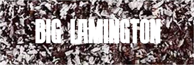
full court press to blame?  Part of me thinks that it is great you can be acknowledged as a painter without actually seeming to know how to paint.  That sounds like a terrible thing to say but really Tom will just have to learn to live with comments like that for. the. rest. of. his. life.  Unless he changes his style.  The jokes on all the haters anyway as it is a trick Tom seems to be pulling off over and over.  Certainly no "decorative obsequiousness" here.  Would I want one?  Hmmm, maybe.  I could go a 'Self Portrait with Lamington'.  I think I've mentioned a couple of times before that I am a big fan of tiki.  And I was really feeling an exotic vibe from Rosie Deacon's Face Feels series (above).  Again with the naive but this time with feeling.  And much brighter colours! I think a few high vis pinks, oranges and yellows.  Again, I could go for a few of these, and you'd need a few.  This is one of those pieces that works well displayed en masse but would look a little lame on its own.  I know from experience, I have a little Penny Byrne that looked great with its mates in the gallery but is pretty sad all by itself on my shelf (by the way, just checking out S+S website trying to remember Penny's name and it looks like she's been cut from the roster - tough gig this art biz).  Mitchel Cumming's this picture isn't absolute (below) was an interesting conceit.  Mitchel has copied the Tintin illustration of Professor Calculus from the coffee cup (foreground) into a diptych leaning against the wall.  Reason? None that I could think of. But luckily for Mitchel a lot of people like Tintin.  And I am one of them.  Other hits included Angela Garrick's colourful patterns, Anna Kristensen's Column and Emily Hunt's totes over the top collage work called Fermi's Paradox (image bottom).  This even has clocks embedded behind the canvas.  This was one of my early favourites but I feel now it has too much going on in it and I think I would prefer Emily to split this up into a series of 12 separate works.  Some of the squares are much better than the others.


Points:  This is a tough one.  Tom Polo will take the 3 points!  Keep up the good work.  My advice to artists is to beware using titles where the wikipedia entry threatens to be more interesting than your work.  Luckily for Emily Hunt her Fermi's Paradox just did it for me, and she will grab the 2 points.  1 point will go to Rosie for the tiki faces.  I love tiki all year round but especially at Father's Day as the junior critics buy me a tiki mug every year and this years was a beauty.