Saturday, September 12, 2015

Sydney Contemporary - 10-13 September


Okay, so the we'd done the online preview, now for the real deal.  I had 2 visits to Sydney Contemporary this year.  Thursday night where I met up with my in-laws and then I took the Friday off from work to see all the stands at my leisure.  Let's recap the fun of the fair ...


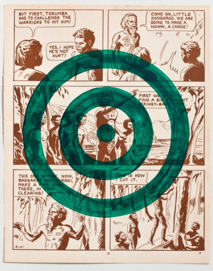
First the good.  It is chock a block full of galleries.  And you would feel like you were missing out if you weren't there.  I went to a talk this year which was quite good (Talent Borrows / Genius Steals) and I must say the food and drink are quite decent, although don't bother on Thursday night as it is a shit fight in the queue's, it's much more bearable for Friday lunch!  The bad?  Well, I'd ponied up for the VIP ticket this year, and that was pretty much a waste of money.  The good stuff still sells out first thing.  And the emergence of other fairs such as Spring 1883 does seem to have robbed Sydney Contemporary of the really cutting edge galleries.  I was only wowed by a couple of spaces this time.  My top pick of the galleries for their total output was probably Michael Reid.  I liked his Joan Ross video up front, the Christopher Pease paintings (pictured below) and, although I think they are pretty pricey, I don't mind the Christian Thompson's photos.  I also loved his tribal urban stand where they had some PNG artefacts combined with Samuel Tupou's bright works and another random Joan Ross piece.  Sophie Gannon also had a strong showing, but that was mainly due to the Danie Mellor wall.  A couple of great photos on silver paper and these perfectly sized circular works (example pictured above) which would've been my purchase had they still been available.  If you were following my tweets (and obviously you should) then you would also recognise the piece up top.  Reko Rennie's Crest was one of my favourites and despite the strong pitch to my parents in law they didn't take my advice!


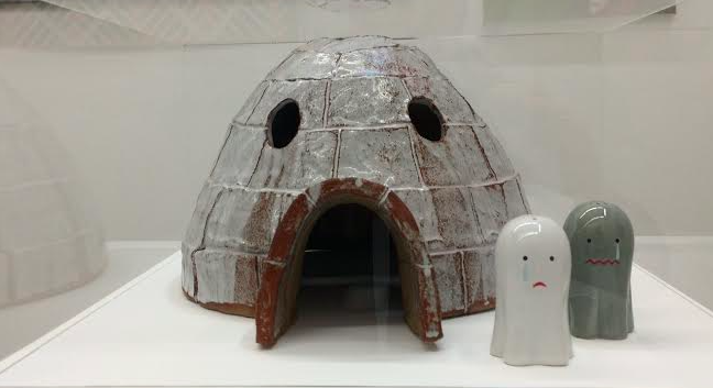
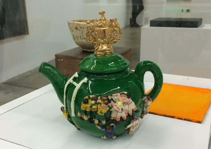
So with the highlights (and lowlights) checked off, now lets run through some other artists that I noticed and some other random rantings.  Kawita Vatanajyankur's video Squeezers (below) was good.  I thought Phil Shaw's Frequently Asked Questions photo was witty.  I enjoyed the vibrant impact Dani Marti's wall sculptures of reflectors made.  I thought the big Ben Quilty install at Jan Murphy was suitably awe inspiring, but mainly from a size perspective.  David Booth's Tokyo Tickets was restrained and interesting.  Bruce Makowsky's branded hand grenades caught the eye as did a few of the Greg Semu photos.  Especially the one where, to borrow a phrase from Ali G, he really looked to be knobbing her!  Final rant would be the inclusion of galleries that only really traffic in the secondary market like Justin Miller.  Can we please support living artists?  I realise Tim Storrier isn't dead yet but quite a lot of his stable was.


Points:  Three points for Reko's Crest.  Easily my top pick.  I will upgrade Josh Azzarella's 1 preview point to 2 as his video work (once I found it) was great.  And you could use your iPhone to take a snippet with no questions asked (refer to the topic of the talk I went to).  Lastly Danie Mellor will take the one point, not that he really needs the extra recognition but I think it was great to have a selection of smaller works available at a fair setting.  Starting at $900 for the tiny ones and working up to over $10k is some clever merchandising.  See you in 2 years!

Wednesday, September 9, 2015

Sydney Contemporary - coming up!


As you were, art lovers!  The Fair is back in town.  Is the Big Lamington fired up?  You bet.  After a couple of busy months on the M&A front we are taking a well deserved day of annual leave on Friday to get amongst the good stuff at Sydney Contemporary 2015.  So be sure and come back on Sunday to see the hits and misses, or even find us on twitter to get uninformed reactions in 140 characters or less.


In a new twist, the folks from Sydney contemporary have put the whole (or at least a lot) of the art up on the web beforehand.  Bold move.  Pre-sales must have done well!  It's hard to judge with all the scrolling and zooming required but looks like some interesting stuff on show.  Some favourites are there, recognised Liam Benson at arterial, Nana Ohnesorge at pompom, Joan Ross and even Greg Semu (picked up the 2 points at Sydney Contemporary 2013).


A few new names caught my eye.  Great to see Palmer Art Projects exhibiting, and their stable looks good.  Will be checking them out.  Good to see some NZ galleries making the trek to the West Island and it was great to see Michael Reid find one of my own creations from the early 80's, pictured below.  It's not?  Oh apologies, but that is Marc Etherington rocking the He-Man homage!
 

Preview points:  What can I say, one of my favourite cartoons growing up.  Marc, you get the 3 preview points!! And that is a very realistic Beastman no matter what the other critics say.  2 preview points will go to the Connor Brothers for their witty use of text in art (pictured second from bottom).  1 preview point will go to Josh Azzarella for his untitled video work (pictured second from top).  Will be very interested to see this as the source material, Hitchcock's North by Northwest from the looks of it, is probably my favourite movie of all time (okay after Star Wars).  As a random aside, I retraced the steps of this movie when I lived in the US.  Starting at the Plaza Hotel, to the UN, Chicago and then to Rapid City South Dakota for Mount Rushmore.  Highly recommended!

Saturday, July 11, 2015

Visible Storage at Artbank - 11 July.


So Artbank has moved. Ostensibly to a more retail friendly precinct, although I think that the whole Danks Street area has has never really lived up to the early hype.  One of the benefits of the new space is they have a gallery area where they are now putting on shows from the stockroom.  Their latest is called Visible Storage (I get it) and features over 200 works on yellow walls, cause why not, yellow.


Artspace says this show contains emerging, mid-career and established.  Known and unknown.  Although, it leans a little more heavily to the unknown to this punter.  And the room sheet is pretty hard to navigate with show this big.  On the recognisable front I clocked a Mitch Cairns and a Michael Lindeman.  I recognised the Cairns from my tour to Artbank a few years ago.  Liked them both and you could rent them together for $550 for the year.  Actually that was the deal for this show, any 2 works were just over 5 hungy. 3 works $770, 5 works for $1,100 and you are getting the picture this scale went right up to $27,500 for the whole room!  That sounds like a good deal but upon getting home and taking a spin around the leasing part of their website you'll find quite a few works for under $200.  Not bad.  They were a few empty spaces - Artspace is letting you walk off with the art and they are putting a small notice in its place - although I get the feeling that is not necessarily the whole point of the exercise from Artbank's perspective, just making some of their stored works visible I guess!


Points:  To be honest I was a little overwhelmed with the choice on offer so I am going straight to the short list.  3 points for Paul White's 'Just off Sunset' 2007 (middle), I love a good illustrated panel van!  And I am also a  sucker for text in art, so 2 points for Matthew Hunt's text heavy 'Heartfield' series from 2006 (selection above).  I liked the style of 'Back Lash' although I would be putting 'Hula Hula' straight in the tiki bar.  Lastly, I am going back to the turn of century for a bit of socialist kitsch.  Graham Blondel taking the 1 point for 'Workers Collective' (pictured top).

Saturday, June 27, 2015

Everything & Nothing at Sarah Cottier - 27 June


Everything and nothing.  Covers a lot of bases really.  Not sure where they were going with this here. Sadly, I only picked up the room sheet and not the essay so I am going to have to wing it ...


For starters it's a good old fashioned group show.  And this being Sarah Cottier it is at the edgier end of the conceptual / commercial spectrum.  The Mikala Dwyer plastic sculpture was interesting, looks good in the gallery but not sure how this see through work would go at home.  That said I'd fit this in more easily than the Tim Bruniges Piano, which is (naturally enough) upright piano sized.  Great to see someone up cycling an old piano - although I am interested that this P.O.A work is an edition of 3!  A firm family favourite (I had all the 3 junior critics with me) was Gemma Smith's 'Radiant Greige' (pictured above).  This was a small work, 34cm x 28cm, but packed quite a visual trick.  At eye level it is half grey / half pink.  Moving up, the work turns pink and moving down it goes grey.  I've tried to show that in the above snaps.  The kids initially didn't think much of it, being grey from their vantage.  But they did think it was cool as it changed colour, and I was kept very busy picking up junior critic after junior critic.  They also liked the Todd McMillan video work but that's the youtube generation for you.  I lean more old school, which means a nice big framed print will appeal to me - and Sarah Mosca has delivered a great abstract one called 'Gestural Ode' (pictured top).


Points:  Gemma is going to take the 3 points here.  Radiant Greige was a family favourite, and I even learnt a new word (greige that is).  2 points for Sarah Mosca's massive 190cm x 155cm print.  Koji Ryui will take 1 point for the Spring sculpture - which was quite a nice little piece and it had a cool plinth.

Friday, June 19, 2015

2015 Yen Art Award at Gaffa - 19 June


"Now in its 4th year, the Yen Staedtler Female Art Awards is back to bring you the best in homegrown female talent".  Well, with promo copy like that, who is the Big Lamington to resist saddling up again to see who is emerging in 2015 (you can click here for 2014 and 2013).


I missed the opening but thankfully the organisers were keeping the winner a big secret, seriously I had to google this after my visit, which meant I was able to pick my point winner without bias (ha!). On the whole, I didn't think this was as strong as the prior years, and I am not sure why that is.  The prize is fantastic for an emerging artist, you get a solo show at Gaffa as well as a feature in the magazine.  As well, the judges seem to favour the "serious" artists that have graduated from a top art school (last years winner was a BFA (Hons) and this years winner is doing her MFA).  I recognised Eliza Slater's work immediately.  Eliza had taken a point in the NAS graduate show last year and had entered the same work here, nice work being selected as a finalist (image above on the right).  I liked Miranda Lorikeet's name and her entry, 'Dive / Survive'  According to the bio she did this in her lunch break on MS-Paint.  Great to see some amateur's / hobbyists involved.  This work (image above, middle) was a little pixellated when printed out to 100 x 80cm, but that could have been on purpose.  I don't think it is a Yen art prize unless there is a bit of embroidery involved and I wasn't to be disappointed this year.  Annie Comelli has made the cut with a collection of works focusing on her vajayjay.  I liked the illustrator style of Anna Gareeva (image above on the left) and similarly the rough graphic design style of Nicola Mitchell.  A standout was Louise Zhang, who I recognise from Artereal.  Her colourful, abstract work 'and it came from Goo Lagoon' (pictured top) was also big (125 x 126cm) so really differentiated itself from the mostly figurative crowd.


Points:   I am going to agree with the judges here and give 3 points for big and colourful.  Well done Louise.  Eliza is going to take the 2 points for her screen prints.  I will give one point to Annaliesa Horne for the North Sydney Bears inspired drawing (pictured above).  Always great to see some cross over between NSW Cup teams and the arts.  Also highly commended to the team from Yen for keeping this going.  And they do a handy little online publication where you can see all the finalists and get a bit more info, it's here.


Saturday, June 6, 2015

Leah Fraser at Arthouse Gallery - 6 June


I've only noticed Leah Fraser over the last year, but I've really taken to her style (she got 2 points at the Blake Prize and 3 at a group show at the arthouse).  So I made a beeline back to the arthouse on Saturday when I saw she had a new solo show, Message from the World Invisible.


En masse, you are completely immersed in the fictitious world that Leah has developed.  And I liked it.  And it wasn't just me, as this show had sold out on opening night.  All women buyers too according to the gallerina.  I can see that, there is a strong Frankie magazine x Del Kathryn Barton vibe running through this show (Leah used to work for Del Kathryn Barton).  I particularly enjoyed the overuse of birds and flowers in these pieces.  Despite the naive style (the cockatoo and kookaburra's are particularly funky) you really get the sense that Leah has put deliberate thought into the different species to use, which I appreciated as a viewer trying to decipher the images. Native orchids, tropical plants, flowing hipster beards. These paintings had. it. all.  As in the recent group show, Leah has included a few interesting ceramic pieces.  I really liked the incorporation of the raw crystals / semi-precious gemstones into the pieces such as in 'Turn Your Body to Light Shaman' (pictured below).


Points:  3 for the prolific hibiscus in 'My Heart Belongs to the Sea' (pictured top).  2 points for 'We Sang Songs beneath a web of Stars', and I will give 1 point for the spears of what looked like dendrobium speciosum in 'His Opal Hands Gathering You'.

Friday, June 5, 2015

Chris Twiney at Gaffa - 5 June


I haven't been to Gaffa for a little while, but the email newsletter piqued my interest last week.  Luxury packaging design rebranded with rural towns? Well that ticks a few of the Big Lamington's boxes so we nipped over during the week to learn more about Chris Twiney and his show 'Rural Gucci'.


Turns out Chris Twiney is an emerging visual artist based in Sydney.  And according to his CV, this is his first solo show.  Even better he has a good little website so you can see more of his earlier work.  Chris is apparently using the luxury branding to highlight the widening economic divide between cities and rural towns in Australia.  I love the concept here, with its hints to Elmgren & Dragset's Prada Marfa and those t-shirts that say "London / New York / Paris / Moree". My only question is in regards the disparate towns presented. They are all over the map, literally.  Yass, Collector, Berrima, Braidwood, Hobrook (all NSW) and Glenrowan (VIC) are all within striking distance of an ANU arts student, I guess, but they're not on the same road trip.  If you were going for disadvantaged towns you could probably pick some better ones than Berrima.  And if you were being a little more collector friendly, you could have picked some better known towns as well!  I mean Holbrook?  Anyhow.  My favourite pieces involved the packaging, but then again I love the aesthetics over at the Dieline. Braidwood got the Hermes treatment (pictured top), Holbrook got the Tiffany blue box, and Collector got the Chanel white shopping bag.  The screen prints were good, again I liked Braidwood and also the YSL version of Yass (pictured above).  There was also a great photo were Chris had re-fashioned the sign at the entrance to Yass.  All in all a great debut solo show and I will be interested to see where Chris takes this theme.


Points:  3 points to the Braidwood box.  2 points will go to one of the screen prints.  I probably liked Braidwood's the best again and while it is looking like I have a soft spot for this town, regular readers would know I'd prefer something from the Hunter or the Southern Highlands!  The 1 point will go to the LVMH wheelbarrow (above).  This didn't really question the economic plight of towns but was a nice fun inclusion to the luxury theme.  Great show.

Saturday, May 30, 2015

Tony Schwensen at Sarah Cottier - 30 May


"If you liked how Tom Polo became an emerging art star without learning to paint, then you are going to love how Tony Schwensen has been able to sustain a career retrospective with a $200 Bunnings voucher" - Irvine Welch
Okay, so that quote is made up.  But I was made to think of the transpotting novelist's collection of short stories when I toured around this solo show at Sarah Cottier.


And it might surprise you that, on the whole, I didn't mind it.  But that was mainly due to the presence of 'Border Protection Assistance / Proposed Monument to the Torres Strait (Am I ever going to see your face again?)'.  This work from 2002 (pictured top), mainly appealed due to the use of the famous Angels crowd refrain as an apt summary of Australia's approach to illegal maritime arrivals.  Most of the other pieces seemed needlessly conceptual. Namely, Monument to Progressing Thought (aka the wheelbarrow on the car stands) and Elegy to the Australian Republic (aka the pvc pipes set in concrete in buckets with the coloured lights).  But I may have just been reacting to the titles.  This guy has a PhD in art, I wondered if his thesis might have been "Alternatives to the use of (Untitled) in contemporary art".  Tony was at it again around the corner.  Here is a room with vinyl letters spelling out Nothing Makes You Free in three languages.  This title is a beauty: 'The Indelible Stain of the White Australia Policy / or the gates of Manus Island / or for all the lucky cunts in the lucky country'.  My problem with it, is that all the work is in the artist statement, the actual idea is very lazy (the analogy to Auschwitz's work makes you free).  Is there a contemporary art version of Godwin's Law where the first artist to link Australia's immigration policies to Nazism has to give back all their Australia Council grants?


Points:  I am going to give 3 to the Torres Monument.  I will give 2 points to the party lights because I am a republican and will give 1 point to 'The Idiot' (aka the steel bucket with speedos stretched around it with concrete and a steel post). This was at least easier to guess the subject given the literal metaphor that red speedos have become (for better or worse, but I'm a sunburnt lobster type of guy myself).

Saturday, April 25, 2015

2015 Gallipoli Art Prize - 25 April


One of my favourite art little art prizes, the Gallipoli Art Prize is in its tenth (and by design) last year. Out of all the random little art prizes I am much sadder about this ending than say, the Blake Prize.  Walking around you knew exactly where you were, all the entries were right on brief.  Let's take the elevator to the second floor of the Gallipoli Memorial Club and check out the finalists ...


So it was good to see this art prize get a bit of press.  By now you may have read that Sally Robinson won the $20,000 for her Boy Soldiers.  All in all this was a worthy winner.  This year I really noticed how popular animal entries have been over the years.  A dog in a gas mask won the prize (and my 3 points) in 2013. A pigeon bearing medals took my 3 points last year.  And again there are animals everywhere this year.  I think the donkey's had it with 4 representatives but there were at least 2 horses and even pigeons again!  Of the donkey's I did quite like Martin Tighe's 'The Burden' (top).  This work also took out one of the judges highly commended's.  Alison Mackay's 'Fallen' (bottom) was actually two works.  The spoons were in order on the left and all mixed up on the right.  I think there was some deeper meaning hidden here but more importantly if you look closely she has managed to include both a donkey and a pigeon!!  Leaving the animals entirely out of it there was quite a lot of portraiture, of old diggers, of young diggers, of generations of soldiers and more.  To be honest, that does get a little generic en masse.  Of the figurative works I probably likes Susan Sutton's best, her 'Out Came the Sherrin' (pictured middle) showing some soldiers enjoying some down time.  And very appropriate although I am not sure I left my slouch hat on whilst playing footy at cadet camp!


Points:  3 points will go to Martin Tighe's donkey, s/he looks like s/he needs it!  I will give 2 points to the spoons which appeals to the badge collector in me and I will give 1 point to Susan Sutton.  I might have scored that one higher if it wasn't AFL.  Seriously this is Sydney.  Our diggers played league!

Saturday, April 18, 2015

Tony Albert "Thou didst fall" at Sullivan Strumpf - 18 April


Tony Albert's career has gone from strength to strength, he is winning art prizes left, right and centre, he has just opened a major new public sculpture in Hyde Park and to top it all off he has the creme de la creme of the Sydney anonymous art blogging scene turning up to his latest solo show at Sullivan + Strumpf on its opening day!


S+S's (gee I'm using a lot of S's today) ground floor has the big works on show.  There is a large bronze sculpture (which is actually a miniature version of the Hyde Park bullets, but it is still pretty big).  There are some overscale anzac'esque mixed media assemblages which to me just screamed "institutional buyer", mainly due to the size (one was 550cm long, the other 270cm high) but also due to the six figure price.  I really loved some of the components of these assemblages, especially the camouflage 'rosettes' with vintage aboriginal badges at the centre.  My favourite works, as is often the case, were in the upstairs gallery.  Here the star of the show was Wake Up (pictured top).  This is the classic aboriginalia inspired mixed media work with the military twist that has the trademark text included.  That is, this work ticks all the boxes you'd want as a collector and no surprise it has been picked up.  If $48k gives you sticker shock (and make you kick yourself for not picking up a Tony Albert watercolour from Jan Manton when they were selling for 3 figures 6 years ago) then Tony has a few prints of the work that he has embellished in different way at a more friendly price for younger collectors.  I really like how Tony does this, takes a print and makes it special through re-work.  A few punters agreed with me as these had all sold pre-opening.  What I think makes Tony such an interesting artist to follow is that he is always trying new things.  What do I really mean by that?  Well certain artists in Australia (and globally really) do get 'stuck' in a certain style - you look and it and can name the artist straight away.  Tony is always evolving but referencing back, velvets, photography, watercolours and now these very large (150 x 200cm and up) acrylics on canvas (you can see them in the background of the middle photo).  They are based on old WWII era cartoons but they have some images painted on top, which again reminded me of the watercolour series I saw all those years ago.  Now if you look to the foreground of that middle photo you will see some fabulous cabinetry.  This bullet-legged cabinet contains an art diary that Tony kept whilst doing the war memorial commission.  I hear it is going to the City of Sydney.  Lastly, but not leastly, I looked through the Green Skin series of works where Tony has daubed over some collected images.  I loved these and to be honest was quite partial to some of the vintage comics he has transformed.  Hmmm, what is that art budget again ...


Points:  I am giving 3 points to Wake Up.  I also like its circular shape, which on further thought is reminiscent of an old Anzac day badge.  It also recalls the target shape that Tony uses throughout his work.  2 points will go to the war diary cabinet (hopefully City of Sydney will have this on show somewhere so we can come back and study it better).  1 point will go to one of the Green Skin series (of them all I would choose the target above).


Friday, April 17, 2015

Artexpress 2015 - 17 April


Last week for Artexpress at the AGNSW.  I went on Friday lunchtime and joined the pretty big crowds checking it out.  Seriously, place was packed.  As I mentioned last year, Ben Quilty got his first break in this gig all the way back then.  Are we going to find the next big art star?


Well, I don't think just art star.  To me, the arts subject is getting much broader in 2014 (to clarify, if you are at Artexpress in 2015, you did the HSC in 2014).  Certainly not all of these are 'fine arts' as you would've once expected.  One student has a big architecture project in here.  Quite a few seem to have promising careers in graphic design.  Darien Law's Simple Cinema (extract above and also pic bottom) was great.  Now I've mentioned before that one of the BEST things about artexpress is that the students need to list out their artist influences.  Darien listed Chip Kidd and Alvin Lustig.  Recognise the names?  Only 1 for me.  Chip Kidd is a well known book designer and it turns out so is Alvin.  Darien has been inspired by book design to make new movie posters.  Now it might be hard to make out all the posters in enough detail online so I've put 2 above for you to work out (but think quick as I'll put the spoiler with the points).  It was great to see all the punters in the AGNSW trying to do the same 'name that movie' thing.  Quite a few I didn't get but it was a lot of fun playing.  Another student taking a populist path was Jordan Abram.  One of his influencing artists was Eugene Tan.  Who?  Oh you mean ::uge from aquabumps!  Don't get me wrong, I am at Bondi every week, subscribe to (and was even featured once!) on the daily email.  I love aquabumps, but is it art?  Jordan has taken a photo of random (and not so random, hello Tony Hawk) punters in Bondi and combined it with a little quote of theirs has produced a photo book called 2026 (Bondi's postcode).  I was going to say it reminded me of the blog 'Human's of New York' until I researched his other art influence, Brandon Stanton, and discovered that he was the photographer / blogger of HoNY fame.  Still following a populist (cartoon) aesthetic but with a bit more art theory was Li-Hsien Lee.  Her work, The Artyssey (pictured top), was a series of panels that told the story of an art disciple learning from a master.  I liked how it appropriated the traditional chinese style but was created entirely digitally.  Li's influences ranged from Herge (i.e. Tintin) to Noel McKenna (he is everywhere at the moment!) and even Brett Whitely.  Also in the show this year were extracts from the students art process diaries and my favourites were Li's as you can see how she did these panels in digital form.  Very illuminating for an analog critic.


Points: 3 points to Li-Hsien Lee for her Artyssey.  It was a great little story, lots of fun but also clever in the references to art history and the use of a number of pieces (e.g. Jackson Pollock's Blue Poles) which served as little easter eggs for viewers.  2 points will go to Darien Law for Simple Cinema.  For those racking their brain, the movies for the images in the middle were Back to the Future (LHS) and Jurassic Park (RHS), that is the car needed to hit 88mph and the t-rex made the glass of water vibrate.  Get it now?  I think Darien should put these into a little artist book!  1 point will go to Gabrielle Holmes for her work Once Again, The Facts Have Been Erased.  This was a piece of high concept that wouldn't be out of place in a NY gallery.  You can see Gabrielle's work here.  The rest of the exhibition can be found here.  


Wednesday, April 8, 2015

Easter Show 2015 - 26 March to 8 April


Okay folks, this is the big one.  The show you have been waiting for all year and it is only March.  The one, the only, the Easter Show!  As regular readers would know, apart from running the Big Lamington I am a bit of a prize winning baker and preserver.  And this year was no different with the Big Lamington team elbow deep in chutneys, relishes, jellies and jams all through art month.  It's a real relief to have finished all the cooking, cause then I actually get to go visit the show.  Now, I think I say this every year but it does deserve repeating for those that came in late.  The Easter Show is the oldest art prize in Australia.  The Show itself kicked off in 1823 and awarded its first art ribbons in 1869 (compared to the oldest AGNSW art prize, the Wynne, which kicked off in 1897).  It covers over 500 categories from traditional painting, through photography, to all the crafts and cooking arts. There are many thousands of entries but only a handful lucky enough to bag a coveted ribbon.  The show itself has finished for the year but lets take a look back at the highlights from my perspective ...


But before we really get going I should point out that the Easter Show has some serious art credentials this year.  Art world identity Alison Renwick has been a driving force on the arts & crafts committee for many years and it looks like she has recruited Evan Hughes of the Hughes gallery onto the committee.  They have lined up a great panel of judges including Carriageworks' Lisa Havileh (watercolours), Art months Glenn Barkley (rural subject and/or landscape), artist Lucy Culliton (australian birds / flowers), and dealer James Dorahy (marine / seascape).  Now did you notice how specific some of the categories are?  I just love it.  As well as the traditional, the Royal Agricultural Society has branched out and included digital art this year.  But not content with just saying "digital" they are very specific in their categories of vector art or raster art.  Yep, look them up!


Okay where to start?  Let's get the traditional out of the way.  The figurative section was a bit of a no-brainer in the Anzac centenary year.  Wayne Dowsett's Anzac portrait of Jack Hinde took the blue ribbon in that section and the special committee purple ribbon (pictured above).  Old Jack himself even turned up on the opening night in full kit.  Good work digger.  There was also a pretty decent portrait of Aussie Dick Smith that won 3rd prize.  Staying with figurative but moving onto animals we are at one of my favourties - Australian Birds and/or Flowers.  I really liked the winner here, Frank Hooke's Rainforest Encounter (pictured 2nd from top).  My only fault was Frank's failure to identify the species.  I mean, how do I know it is an Australian bird?  I mean it could be a damn New Zealand huia bird!  For those wondering the most popular bird, by my count it was a tie with 4 entries of Kookaburras and 4 entries of Lorikeets.  Hmmm, maybe I might try to crank out a black cockatoo next year!  Next up is the biggie.  Rural Subject and/or Landscape painting.  Remember Glenny B is judging this one so I am keen to see what he has selected.  And its a nice eclectic selection of winners.  The blue ribbon went to Michael Rogers' The Longest Cattle Trough which was quintessentially rural.  My favourite was probably Madelaine Batchelor's kitschy Easter Showtime (pictured top).  Now, I don't know if it is just because I know Glenn is judging this. And the fact that Glenn has got a soft spot for Noel McKenna. But, I am seeing a bit of Noel in this work.  Or at least it wouldn't look out of place in Noel's collection.


There were a few nice still life paintings, Robert Baird's At the table of Golgotha was a very traditional piece that won him a red ribbon (2nd place).  My notes on the watercolours are memorable for Meredith Cooper winning the blue ribbon for her Cathedral of Ferns.  But Meredith also came 2nd in the Drawing for a work with the same title.  Lucky for Meredith those sections had different judges.  The works are practically identical!  See above, the watercolour is on the left.  Did anyone else spot that?


Onto the photos and it was good to see Paul McMillan take the blue ribbon for best rural photo.  Paul is an old friend of the Big Lamington and a great guy.  I really liked the winner of the urban landscape, Vivienne Noble's And the Stack Came Down (pictured above) which was a great black and white action shot of the demolition of the Port Kembla landmark.  This post is already stretching the server capacity and I haven't even got to the crafts!  It was a relatively disappointing year for tea cosies but the crochet was outstanding.  I would've awarded the grand champion to the cacti arrangement (pictured below).  Sadly this one was NFS but you can often pick up a great souvenir here, we made off with a crochet hippo that won the blue ribbon in the small toy section.  That is on its way to my god-daughter, hopefully she'll be another fan of the Show.


Points:  So, so many to chose from. I am going to give 3 points to the one that nearly got away from Glenn, the Noel McKenna'esque Easter Showtime! 2 points will go to the bargain of the day, aka the prize winning photo of the 'Gong (that black and white photo of Port Kembla was only $53!). 1 point will go to the rainforest bird.

postscript.  this has already been a mammoth post given my usual standards, and we've shown a lot of images but I can't resist (for obvious reasons) one last image from the digital art section.  The Lamington Drive with a Lamington pretending to be pac-man.  Not only did I love it, the junior critics wanted me to download the game to their iPads!  If only kids, if only!


Thursday, March 26, 2015

Liam Benson at Artereal - 26 March


Liam Benson is showing at Artereal? Of course I made it.  Naturally with the Easter Show in full swing it took me a while to get around to documenting that trip.  But with the magic of blogger it looks like this was posted on the 26th, when I managed to swing by the gallery after tasting success with my namesake category in the perishable cooking category at the Big Show!


For those that came in late, this blog is a bit of a fan of Liam's work.  I'd run into Liam at the MCA in December and seen his trademark beard getting bushier and bushier and asked him if he was going to be doing a Ned Kelly.  Bingo.  And here there are.  Now I have long argued you could arrange a whole collection around depictions of Captain Cook in contemporary art (Quilty, Daniel Boyd, Jason Wing etc), and I think I can now safely add Ned Kelly to that list (Nolan, Ha-Ha, Ohnesorge, and now Benson!).  To be honest I was a little confused as to the images.  Liam has applied a camouflage facepaint in styles that are meant to evoke the different gum trees around Ned's bushranging haunts.  The top image is meant to be a red gum, the bottom image a snow gum.  In that way the Ned homage is potentially a little too subtle for most.  I mean, I think a metal helmet somewhere would've helped! That said, I really liked the series.  And I hope he keeps the beard a while longer as I think there should be an accompanying video work.  Also in this show are Liam's continuing needlepoint works (me & you, pictured above) which still look great (although, full disclosure I do have one).  Again, not wanting to keep harping on with suggestions but I think a good old fashioned "such is life" would've gone really well here.  Maybe a little too Ben Cousins but hey.  Now Liam has another whole series in this show where he is wearing see through head outfits of an executioner, a crusader, and a terrorist. That is like 3 separate exhibitions in one, and he is showing again in a group show at Artereal in April.  He certainly has been busy!


Points:  Well, the Neds were the stars of the show in my opinion.  The question is whether I am going for the more colourful or the more subtle.  It's a tough call but I am going to sling 3 points at the Ned Kelly Snow Gum (Kosciuszko) [the bottom one!].  2 points will go to the Blue Gum (coral) Ned [not pictured, go to the Artereal webs].  1 point will go to the Liam needlepoint* Me & you (pictured middle).

*WHICH HE NEEDS TO ENTER IN THE EASTER SHOW NEXT YEAR!!

Saturday, March 21, 2015

Art Month Collector's Space - 21 March


Here we go.  Collector's Space.  My favourite #artmonth show.  The third time it's getting reviewed on the Big Lamington.  Will it deliver again this year? Will Glenn Barkley ask me next year?  Will I find it?  All serious questions!


First up, some details you need to know.  This has moved.  Again.  The space is now downstairs at the Ray Hughes gallery on devonshire street.  Handy if you feel like a pork & fennel sausage roll from the bourke street bakery, although less handy for a midweek assignation. Hence I joined the crowds on Saturday.  Now, there are a couple of novelties for this year.  A nice touch was mixing up all the art between the collectors, previously it had been quite compartmentalised.  I see the itchy hand of the curator at work here.  Another great move was getting some artists involved.  Nell and Noel McKenna both sharing their collections.  Other collectors included this year are corporate type Sue Cato, random IT type Clinton Bradley and random collecting couple from the north shore Max & Gabrielle Germanos.


82 works are listed in the room sheet, and I only have a paragraph to spare so go have a look-see for yourself as this is only going to hit the high notes.  Well I usually like a big Danie Mellor, and Sue Cato's certainly ticks that box.  Actually a lot of her collection ticks the boxes despite the curators intro (saying that collecting is not box ticking).  Shaun Gladwell, Bill Henson, Guan Wei. Tick, tick, tick. I can tell by reading the names that Sue is a little older than me, this is a collection of a certain price range.  I thought the same when trying to piece together the Germanos collection.  Mclean Edwards x 3 and a Euan Macleod.  It does say something to collect in depth, and I respect that.  But in saying that they must really love Mclean Edwards!  My favourite non-artist collector was definitely Clinton Bradley.  Without the ability to play swapskis like Nell he has the collection that I could most empathise with putting together.  Loved his massive Michael Parekowhai (yes I can pronounce it!), pictured top (Cosmo McMurtry).  I can't believe he actually has this in his place.  I mean he can't have kids, they would love it, I just mean there would be no room for it!  It was great, and very timely given Easter is just round the corner.  I wouldn't have guessed Parekowhai, but maybe Parekowhai channeling Koons.  I also liked his Louise Weaver lithograph, recognised the Koji Ryui mini sculptures from Sarah Cottier and appreciated his collecting the 'harder' to categorise work like a powerpoint from Agatha Gothe-Snape.


Okay, I lied.  I could squeeze in another paragraph.  That's just because I'm now swapping to the artists collections.  I think Glenn had another reason to mix up the art on display this year.  If only to disguise how enamoured he was of the artists collections.  With 82 works from 5 couples you would expect about 16 works each. But Nell & Kylie Kwong have contributed 30 works and Noel McKenna has 26 (yes I counted the room sheet, that's the dedication it takes to make it as a quasi-anonymous art blogger these days!).  Now what I liked about the artist collections was the randomness of them. I also loved to look at a piece and try and guess whose it was.  To me, Noel's collection had a strong connection with his own work.  You could see a piece and think, that looks like Noel's.  Just look at that picture 2nd from the top, a grouping from Noel's collection!  The highlights of the McKenna collection in my opinion were the Rugby World Cup teapot by Alma Smith (pictured above) and what I think is an Ann Wallace piece (pictured below).  I also liked his XXXX bottle top curtain.  From Nell & Kylie Kwong's collection I enjoyed seeing what Nell has traded for, including a Lionel Bawden pencil work and a Laith McGregor bronze.  Nell has kept a few of her own works including a nifty igloo with eyes (pictured 3rd from top) but my favourite of hers was probably one of the smallest, a 7 x 3cm Philjames of Mr Freeze.


Points:  well, I know some people think art should be about ideas not money* but to the Big Lamington art is about points!  Now, don't take it personally collectors, but this is what I would swipe if you had an open house ... 3 points to the big bunny (not Nell, the Parekowhai.  2 points to Noel's teapot.  Shame it was 2003.  I'd love a cricket world cup version from 2007.  Maybe tiki mugs!  1 point will go to Nell, probably for the igloo (it kind of also reminds me of the Phantom's skull cave!).  I also love how she framed all these notes from folks like Fred Tomaselli and Dick Bruna as art. Again a great random show, as Glenn would say 'art is the winner today'*.  Looking forward to 2016 #artmonth already!

* art month have produced a lot of pastel business cards with Glenn Barkley quotes.  If you see them grab one, certain collectors items in themselves.